
Optique Carnot
Visual identity, packaging and signage for an optician in the Val-de-Marne.
The project
Optique Carnot wanted an identity that stays with its customers from the shop window all the way home. The work covered the logo, packaging, signage and shopfront.
The approach
No heavy storytelling here. The identity relies on light but striking visuals, so that as many customers as possible can recognise themselves in it and make the place their own. In optics, the frame extends the face: the brand’s elegance had to be felt on entering the shop, then in every detail taken home.
The logo
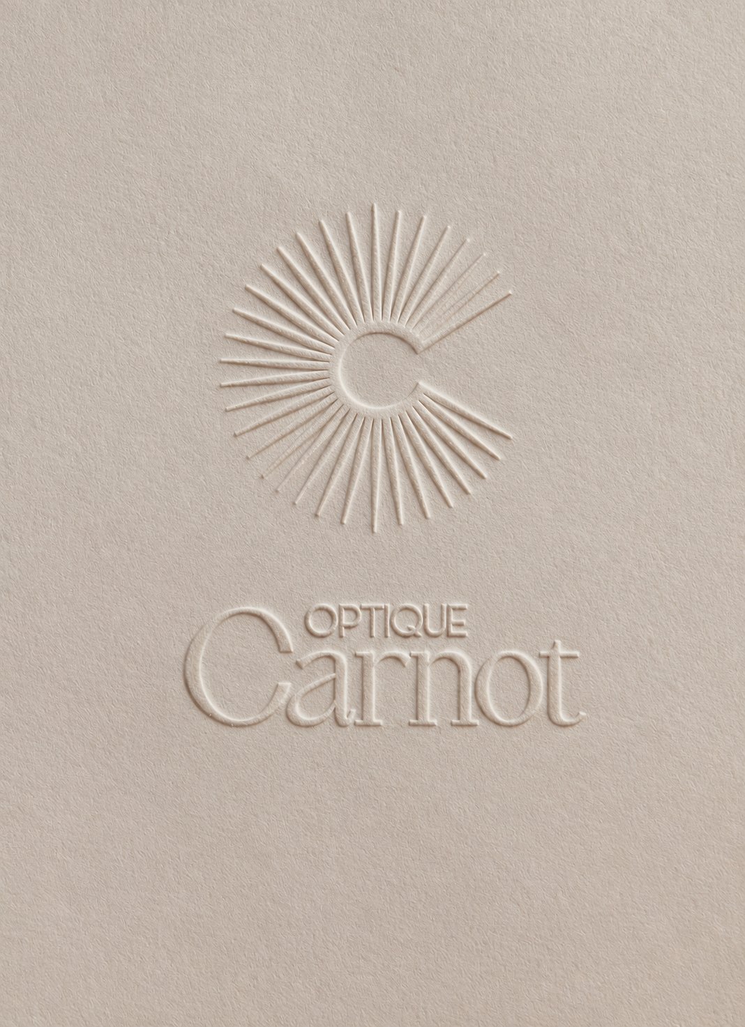
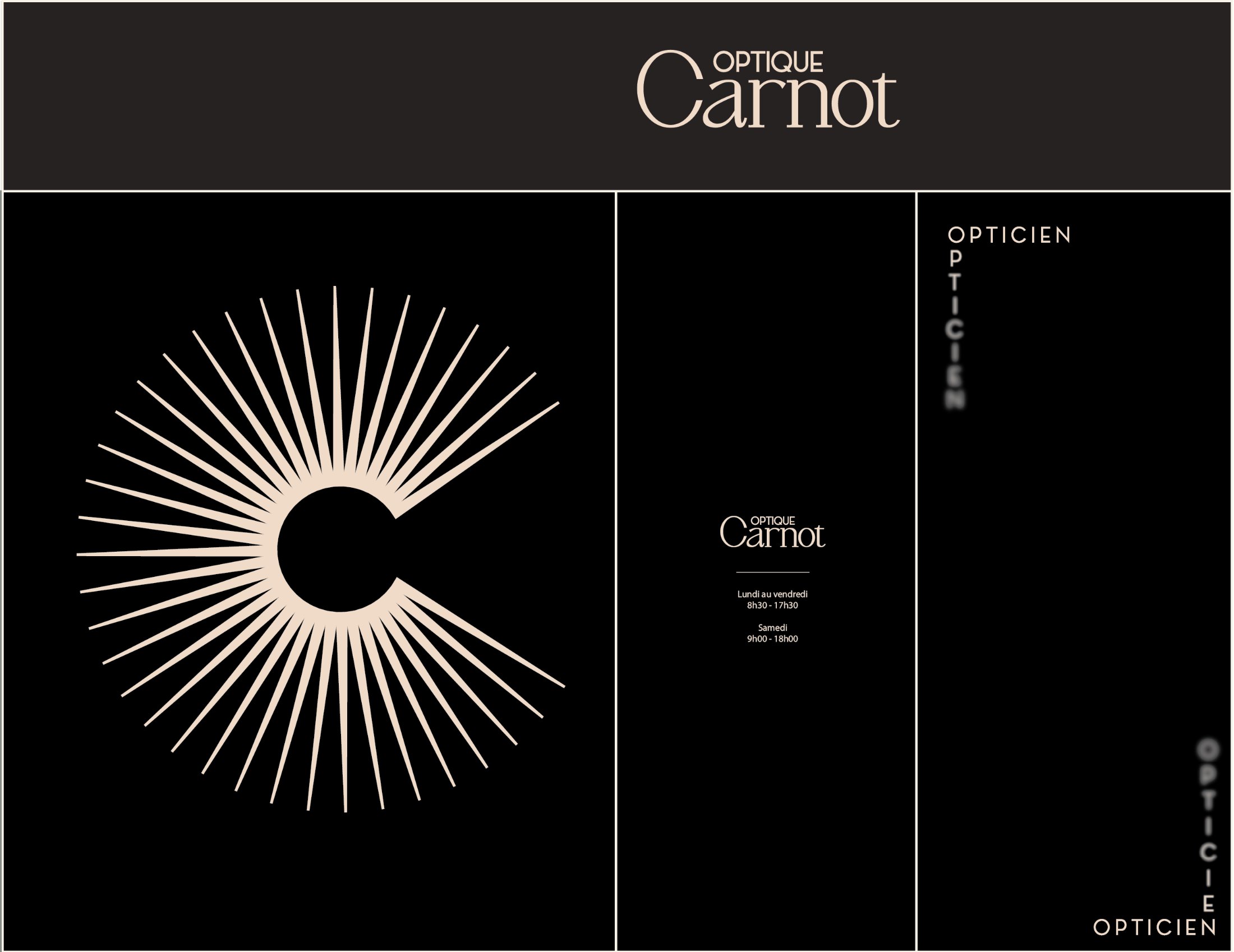
The monogram pairs a C with a sun of fine rays. It comes with a logotype stacking “Optique” in capitals over a serif “Carnot”. The drawing stays simple enough to be embossed, engraved or printed large.

The details
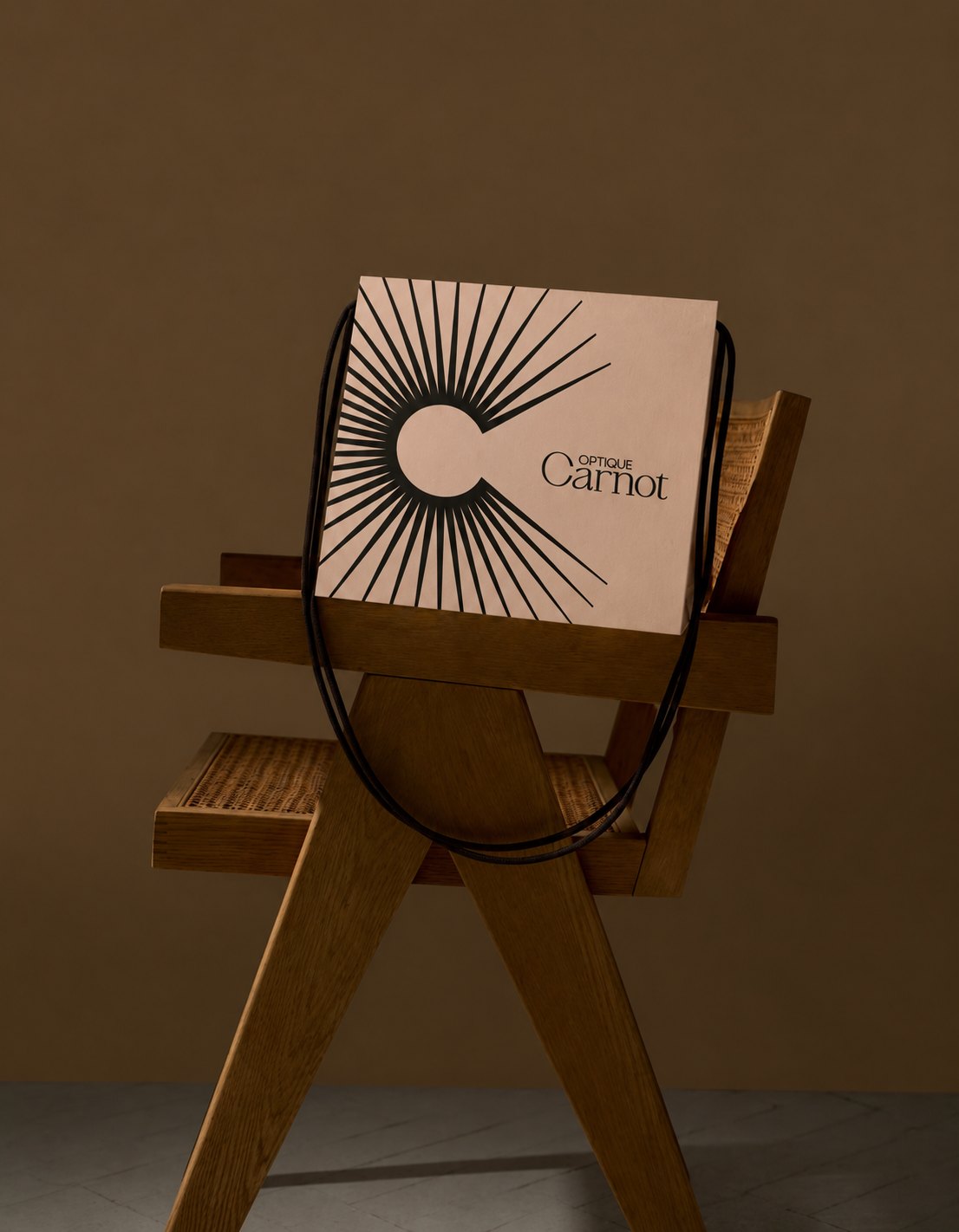
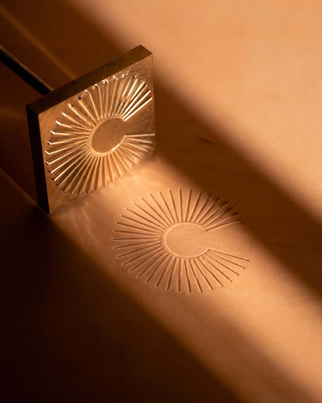
The bag, bottle labels and brass stamp all carry the monogram. Printed in black on the bag, the rays read from a distance. On paper and labels, the mark is quieter, embossed or tone on tone.

The shopfront
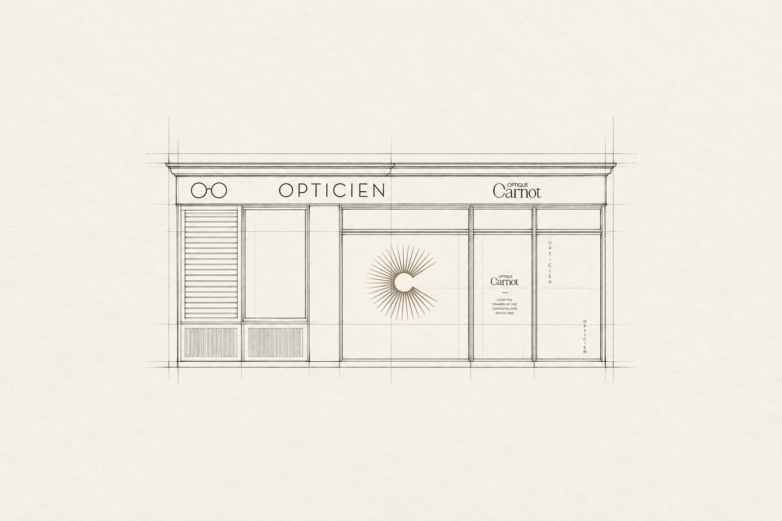
The shopfront was first drawn in elevation, then developed into a signage plan. The fascia carries the logotype, the window takes the monogram at large scale and the door shows the opening hours. The word “Opticien”, set vertically on the glazing, leads the eye to the entrance.
The shop
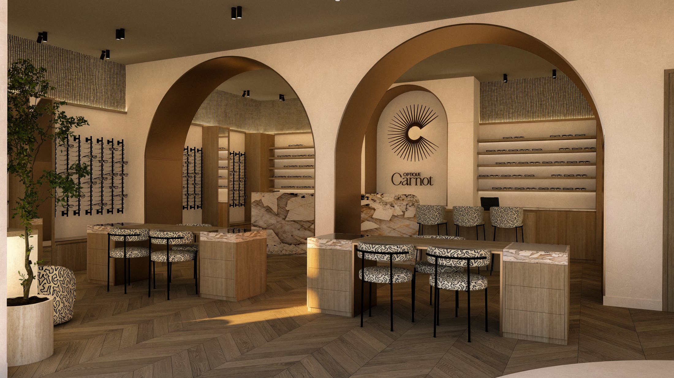
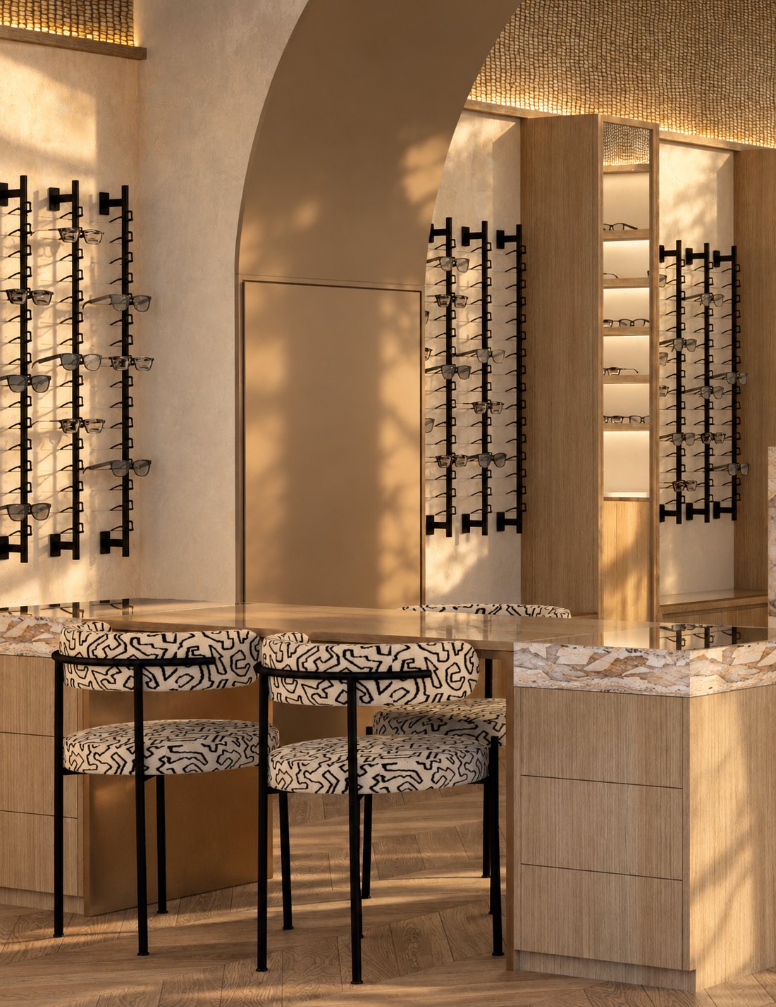
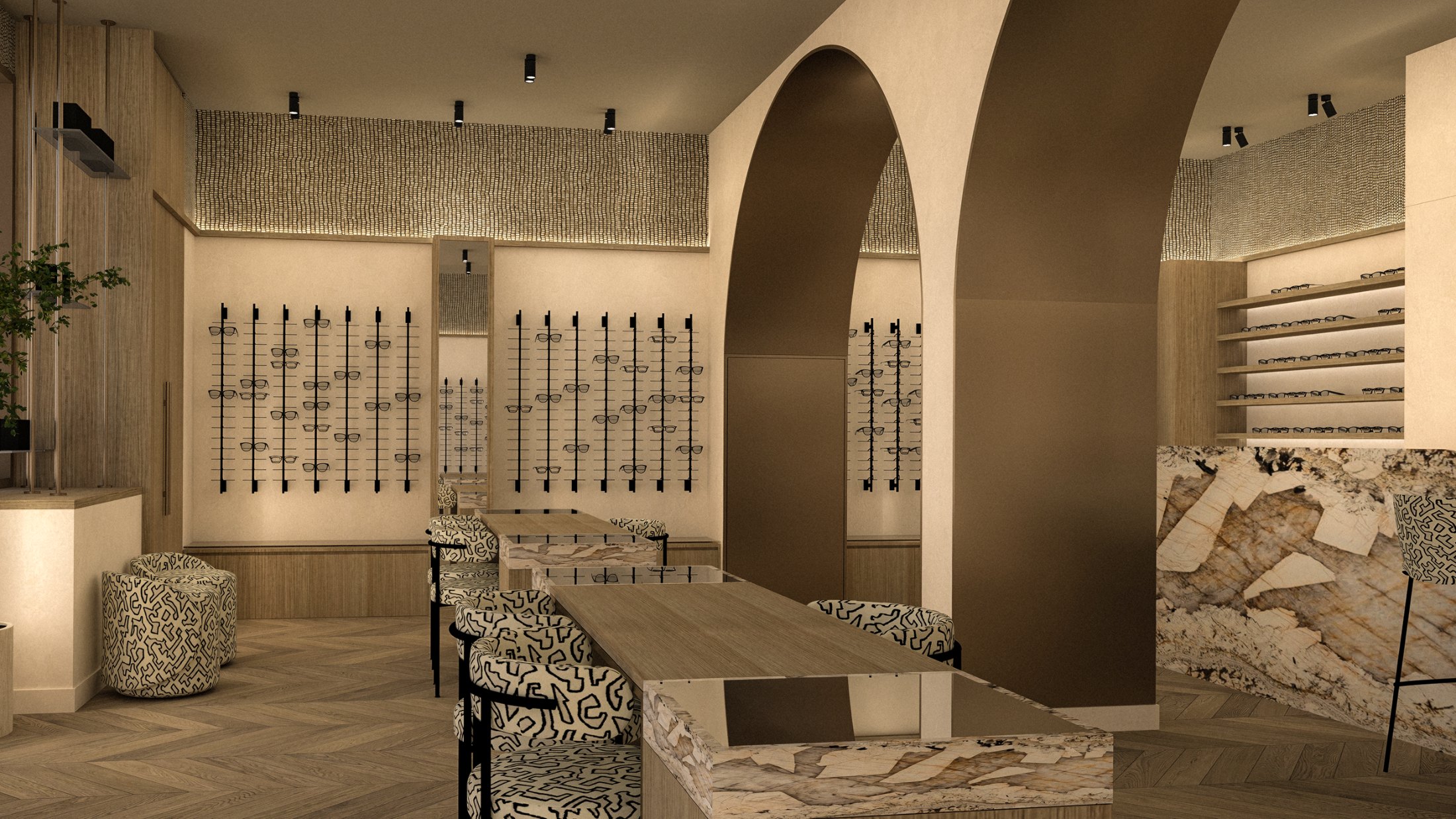
The interior architecture was designed by Elise Nezzar and Patricia Da Cunha Fernandes. Arches, light wood, marble and golden light frame the identity, with the monogram and logotype set at the back of the shop.
About the project
The branding, logo, packaging, signage and shopfront were designed by Jon Filin. The interior architecture was by Elise Nezzar and Patricia Da Cunha Fernandes.
The shop is in the Val-de-Marne, south-east of Paris.
A sun monogram and logotype, packaging (bag, bottle labels, brass stamp), a signage plan and the shopfront drawing.
Yes. On this project, the signage and logo were drawn in step with the interior architecture, so the brand sits as naturally on the shopfront as at the back of the shop.
One vision, from story to place.
Discover the approach →