
Split Nutrition
Creative direction and logo for a fresh meals and nutrition brand.
The project
The name Split Nutrition had been found by Jonathan Jablonski. What remained was to build the brand’s creative direction and draw its logo.
The approach
The split is treated in a very abstract way: a clean diagonal cut that sets the word in motion. The aim was a dynamic logo, in keeping with a nutrition brand, while staying simple and legible.
The logo
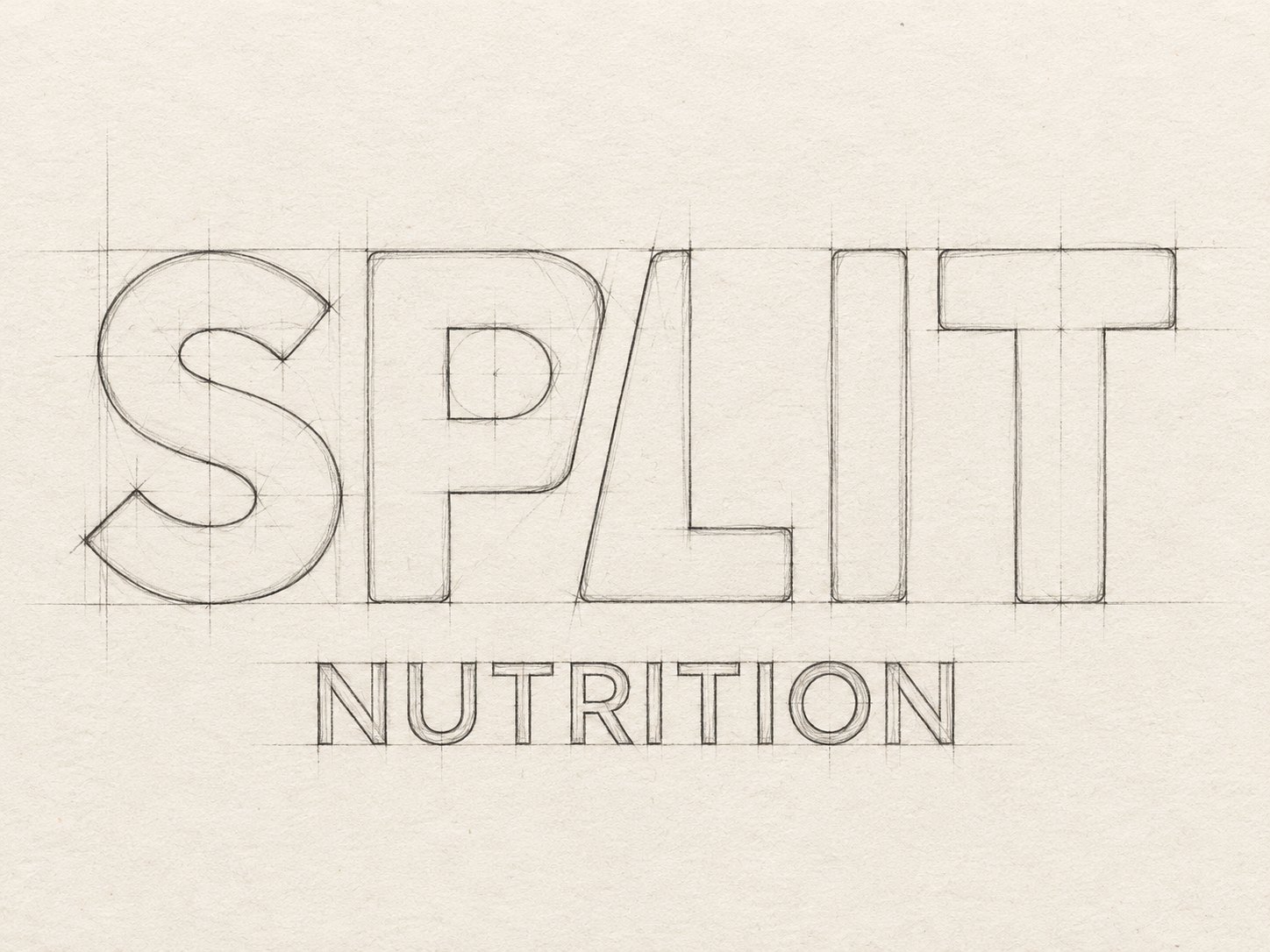
The sketch sets heavy capitals on a strict grid. The P and L share one diagonal, as if the word had been sliced in a single stroke. Below, “Nutrition” in lighter capitals steadies the whole.
Black and white
The logo comes in two colours only: black on white, white on black. This keeps the brand minimal and leaves all the colour to the fresh produce. The shape of the split is enough to make the brand recognisable, without relying on a hue.
The world
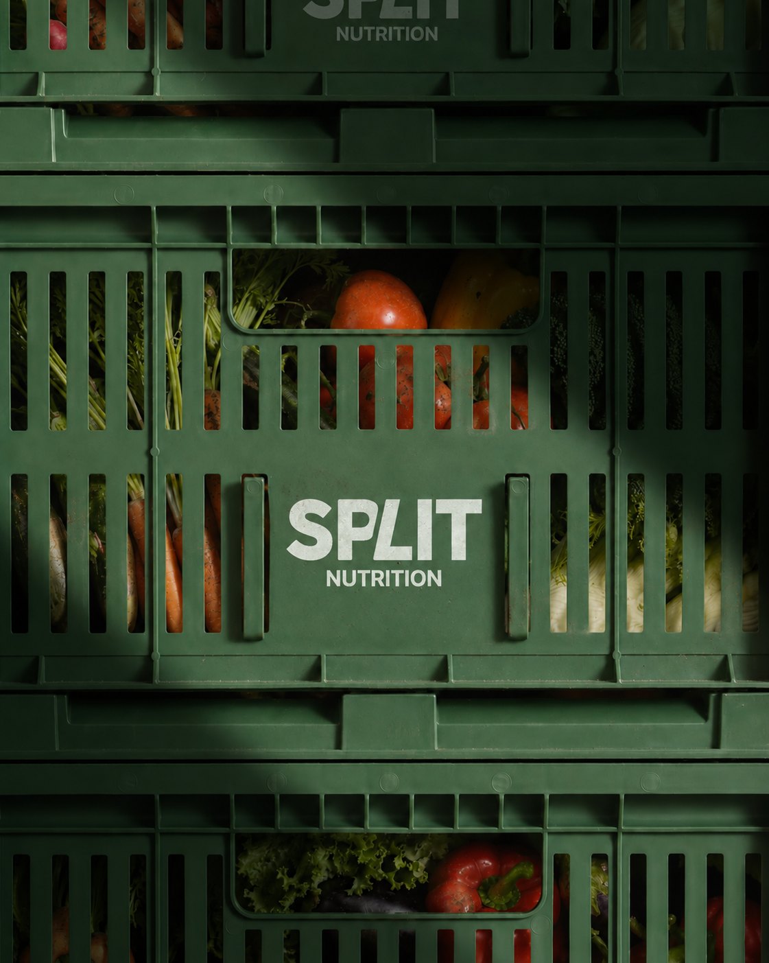
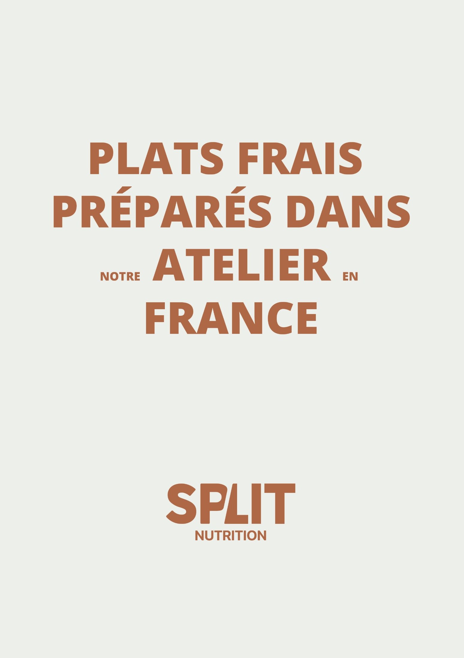
The creative direction pairs a black-and-white campaign film, crates of fresh vegetables marked with the logo and typographic posters. On the poster, the message fits in one line: “Fresh meals prepared in our workshop in France”.
About the project
The logo and creative direction were by Jon Filin. The name Split Nutrition was found by Jonathan Jablonski.
An abstract diagonal cut between the P and L, giving the word a dynamic movement suited to a nutrition brand.
The logo, a black-and-white campaign film, branded crates and typographic posters.
One vision, from story to place.
Discover the approach →